LMU Travel Viewbook for Recruitment
They say print is dead, I say non-functional print is dead. With shrinking budgets and most booklets heading straight for the recycling bin, it made sense to merge our full Viewbook and the smaller travel version into one comprehensive, intentional piece.
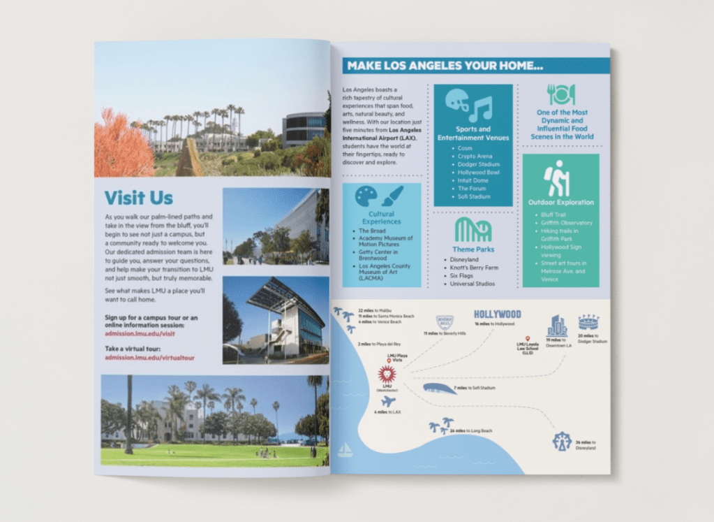
I began by reworking the layout to create a clearer visual hierarchy and a more intuitive reading experience. From there, I refined the copy to better reflect the voice of our students and community. I also designed an illustrated map highlighting key local spots, places that spark curiosity in out-of-towners imagining a future in the city of Los Angeles. Using insights from student surveys, I expanded descriptions of resources that had previously been overlooked or hard to find, ensuring the booklet felt genuinely useful rather than purely promotional.
The final product isn’t just a booklet; it’s a purposeful, engaging tool that respects both our audience and our budget. By focusing on clarity, relevance, and thoughtful design, I transformed a once-disposable print piece into something that informs, inspires, and earns its place in readers’ hands.
LMU Academics and Success Booklet at the Rams Training Camp

In Summer 2024, LMU hosted the Los Angeles Rams’ training camp as part of a major university partnership. To support this high-profile initiative, I was tasked with creating a unified booklet that combined both Undergraduate and Graduate information. The project began with developing a new cover image. I had a clear creative direction, but our existing photo archive didn’t meet the needs of the project; so I captured a new shot myself. The final image became one of the most vibrant and dynamic campus landscapes I’ve produced in my ten years photographing LMU.
With only two weeks to develop the content and design, I created a comprehensive booklet that was distributed during Community Practice Days. Given the tight timeline and the need to maintain strict brand integrity, I conducted an in-person press check (especially important for materials relying on our PMS color palette) to ensure accurate color reproduction and full alignment with LMU’s visual identity standards.
My design approach centered on using iconic campus architecture as the structural element of each layout. I intentionally photographed buildings slightly out of focus so that the surrounding foliage could serve as a compelling backdrop for overlaid text, adding depth and visual interest. For the Graduate Programs section, I photographed a metal grate from a campus building and used it as a textured background, creating a subtle, authentic detail that grounded the design in a sense of place and reinforced the connection to campus.
Admitted Student Guide: Important Resources for Incoming Students

LMU Undergraduate Admission hosts several events for admitted students each spring, and I was entrusted with redesigning the Admitted Student Guide which was distributed to more than a thousand attendees at each event.
The team requested a notebook-style aesthetic that still aligned with the university’s established brand, so I developed a refreshed concept that balanced creativity with consistency.
In addition to updating the design, I expanded the content to better support incoming students. Previously, the guide featured only clubs and academic resources. I broadened it to include information on dining options, local entertainment, on-campus wellness services, and other essentials for new students. The final booklet spanned 16 pages of curated, need-to-know information, complete with key dates for Orientation.
The leadership team responded enthusiastically to the new guide and asked me to adapt it into a PowerPoint presentation. I led the full creative process for both pieces from designing the layout, writing copy, sourcing imagery, and overseeing print production.
